Introduction
While I’ve highlighted best practices and resources on how to pitch your ideas in the past, I thought I’d take some time to share exactly how we prepare for our demos when we’ve been invited to showcase Wufoo at conferences, events and VC boardrooms. We’ve spent a lot of time refining and practicing our workflow for presentations and after doing this a number of times now, I think we have a method that seems to produce results that we’ve been pretty proud of. While the amount of prep work we do probably isn’t for everyone and might be overkill to some of you, hopefully there will be some tips in here that will help you in your own presentations and demos.
For all the examples in this article, I’ll be referring to the prep materials I generated for a 7 minute demo we were asked to do this past summer at the National Society of Collegiate Scholars Convention in Orlando, FL. Because we (the founders) have demoed Wufoo countless times, we had one of our new hires, Tim Sabat, do the presentation to get some experience under his belt. Because this would be his first time with the material and because we’re obsessed about polish, you’ll notice that we leave very little to chance and improvisation.
Getting Started
If we’re presenting something completely new, we’ll start about a week before the presentation. If it’s something I’ve presented before and I have the slides and prep work already done, then I can probably get away with looking at stuff a day or two before. Either way, I’m probably going to be working and tweaking the slides all the way up until the moment before it’s time to go on stage. Because I wanted to try a new script (Wufoo had a lot of upgrades since the last time we demoed it) and Tim was new to this, I treated this presentation as if I were creating it from scratch.
We like to start every presentation with a rough outline. In fact, I pretty much start every thing I ever write with an outline and it’s one of the most common recommendations I have for people that have trouble with rambling and organization. It seems obvious, but you’d be surprised at the number of people that try to wing these things. Outlines keep us focused and help us make sure we hit the points that we need to cover like who we are, what we do, who uses us and the major features we want to highlight in the app. Here’s the outline I developed for our NSCS demo.
Introduction - Particletree - Treehouse - Wufoo What is Wufoo? - online form builder - help people collect information over web - Infopath but friendlier etc. The Transcript
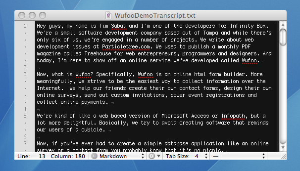
If the time allotted for the demo is under 15 minutes, which this was, then I basically take that outline and write out a full transcript—a word for word articulation of what would be said during the presentation. Not going to lie, it’s a lot of work to do this, but it’s definitely worth it. During a 6-8 minute demo, there isn’t any time to waste on finding your words. We believe a good short demo is like a good short story—it’s carefully crafted. Even with material that feels like I should be very familiar and intimate with it (like talking about a startup and application I created from the ground up), I feel much more comfortable knowing that if I have a brain fart on stage, there’s a safety net for me to read from. Here’s a copy of the final transcript I made for Tim for our NSCS demo.
The first version of this transcript is written as fast as possible since I know that it’ll go through lots of revisions when we start timing it and whittling it down. After the first draft is done, I’ll do a time check. Basically, I time how long it takes to read the introduction, how long it takes to read the demo and how long it takes to read the closing. I’m careful to make sure I’m reading slowly but clearly (I actually have a problem with speaking too fast when I’m confident), which is probably the most important part of this process. For me, I know I’m reading at the right pace when it starts to feel a little uncomfortable. Timing and reading out loud will let you know where there’s flow problems and also what needs to be cut or made more succinct.
For this presentation we aimed for about 2:45 in the introduction, 2 minutes for the demo and then about 2 minutes for the closing. Now, when we first launched Wufoo, we didn’t have any of the information on traction and usage and so during those presentations, our intro was obviously shorter and our demo time was then extended to show more features. One thing we’ve learned about demoing features is that it’s impossible to show everything. Even if I took the entire 7 minutes, I couldn’t show all the things possible with Wufoo and so it was important for us to hit the highlights and then compromise by just showing screenshots of other major features to wet an audience’s appetite and imagination for more.
After I was happy with what I came up with, I sent a copy off to Tim so he can look over it and let me know what phrasings didn’t sound like him or felt uncomfortable rolling off his tongue. I’ll also have him do a time check since he’ll actually be presenting. When that’s done, I’ll leave him to practice while I work on the slides.
The Slides
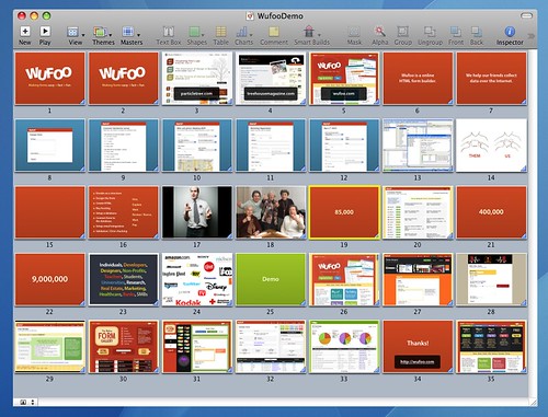
I do all of our presentation work in Keynote. We’re all on Macs and so it’s very convenient. And while I do love the way everything looks on it, I’m pretty sure I could be just as effective with the latest version of Powerpoint. Here’s a copy of the slides from the NSCS Demo.
The nice thing about making slides from a transcript is that it’s much more efficient. When I’ve made presentations based on just an outline in the past, I would usually waste a lot of time making a bunch of pretty slides that ended up being cut out of the final presentation after going through a few rehearsals and timings. In regards to actually designing it, there are so many ways to effectively illustrate a presentation. Since we’ve covered this in past articles, I’ll just share some of the things I like to do when I design one:
-
As you can see from the slide overview above, I like to use a lot of bright colors, images and screenshots. I prefer to illustrate rather than explain.
-
When showing a web site, I’ll cover a screenshot of the site with the url in large text so it’s easy to read even in the back of the room.
-
When I purposely want the audience to feel overwhelmed, I’ll show lots of text or images on a single slide. Otherwise, it’s never more than a short sentence, if that.
-
Duplicate the first slide. A tip I got from Tim. This way you can leave it up on a screen without my notes showing or the timer starting.
-
Try to use humor when possible. Sparingly and tastefully, of course.
-
Add any slides at the end that will easily answer some of the most commonly asked questions (this is why pricing page is added after the Thanks! slide).
Additionally, I try to avoid using any transitions or animations in my presentation. I know some of them can be really slick, but in a demo with strict time limits, not only do I fee like I don’t have any time to waste, but I also don’t want the audience distracted by eye candy that makes them wonder about the software powering the presentation over what’s actually being said.
Using Notes
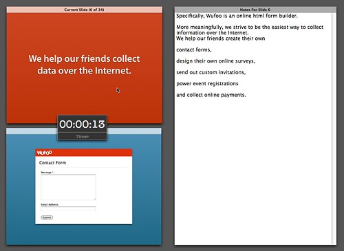
In Keynote (and I’m pretty sure in Powerpoint as well), you can add notes to each slide that will only display on your laptop when showing slides through a secondary display. Honestly, I think this notes feature is one of the most under-appreciated features in presentation applications. Ever since I’ve started using them, I’ve never gotten lost again or wondered why a certain slide was showing in the middle of a presentation. And so after the slides are done, I’ll start to copy and paste the appropriate sections in the transcript into the notes for each slide. Here’s a copy of the slides with the transcript inserted as notes.
One thing that you’ll notice in the slides with notes is that certain sentences or phrases are copied across multiple slides and formatted with odd line breaks. The duplication is done so that if a sentence is illustrated by multiple slides, the rhythm of a sentence won’t be disturbed during the slide changes. Each new paragraph represents when the presenter should proceed to the next slide.
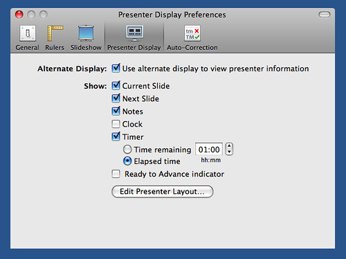
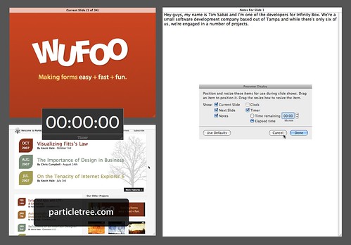
In Keynote, I’m not a fan of the default layout for showing notes. Thankfully, you can change these settings under Preferences -> Presenter Display -> Edit Presenter Layout…
Obviously, you should experiment and find the layout that works best for you, but I like to maximize the amount of notes I can see and so the presenter layouts for my keynotes are set up like this:
Pre-Recorded Screencast
There are a number of studies out there that show that mult-tasking is a myth. Our brains aren’t meant to do it. It should therefore be no surprise that driving your application and talking about it articulately at the same time is a really hard thing to do well—especially, when you’re under pressure to do so in a narrow range of time. During practices, we’d notice that when we tried this, it was never smooth. There would be awkward gaps of silence whenever any thought processing needed to be done to show off a feature and, for some reason, the ability to type always seemed to escape the person when they were talking at the same time. That’s when we made our demos a two man operation.
One person would drive the application and the other person would do a running commentary of what was happening on the screen. This worked out alright, but it also had its issues. For example, there would be this awkward transition where you have to wait to pull out of the program and then open a browser to start the demo part. Because of this, you couldn’t fall back on your notes inside the presentation software, which means you have to effectively completely memorize this part of the sequence along with your driver.
You could bring two laptops, but most displays at conferences aren’t prepared for this setup and you end up with an even more awkward transition that has the potential for a dreaded AV malfunction. Additionally, this also added two additional variables to your presentation: another person and another piece of software. In addition to having to pay for two people to do every demo, you and your driver both have to be in sync and your application just has to work. Even though we would run everything off a development localhost on our laptop so we wouldn’t have to rely on an Internet connection, it always made us nervous. And so after a few presentations run like this, we decided that it would be better to just pre-record the demo as a screencast. Here’s a copy of the movie used in the NSCS demo.
Using a screencast solved the awkward transition problem, allowed us to still utilize notes, eliminate the variables of another person and software and made sure that we would not go over on time for that part of the demo. Keynote makes it very easy to insert movies into presentations. Just drag the movie into a blank slide and it’ll work pretty much like you expect. The only problem I have with it in Keynote is that the movie only plays on the secondary display and not in the presenter layout view and so you have to make sure you’re looking on the screen behind you so that you start speaking at the same time. But when it’s done right, it’s a pretty smooth experience.
The down side, of course, is that you have to do a lot more work ahead of time in prep. For the NSCS demo, I had Tim read off the demo portion of the script while I recorded myself doing the screencast with Snapz Pro X without the sound. It took us about 10 takes to get it just right and in the time span that we wanted.
Keynote Display Preferences
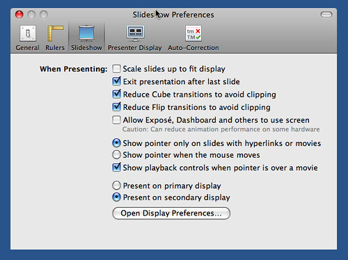
And that’s pretty much how we do it. After all the prep work is done, it’s pretty much up to the presenter to practice it enough for a smooth delivery and to memorize enough of the material so that they don’t have to rely on the script. Before I leave you to make and modify your own demos, I’d like to quickly share with you one last tip. Make sure you set up your presentation display settings ahead of time if you’re using Keynote. Here’s our settings:
Basically, have it set up to Present on secondary display and then definitely check your Display Preferences to make sure Show displays in menu bar is checked off so you can easily make adjustments on the spot. When you’re plugged into the secondary display, then you’ll want to make sure your Mac is not mirroring the primary display (done in display preferences). If that’s done right, your presenter notes will show properly on your laptop and keep you from looking like a spaz when the projector isn’t doing what you expected. Alright, good luck and happy demoing!
Здесь можно оставить свои комментарии. Выпуск подготовленплагином wordpress для subscribe.ru


No comments:
Post a Comment