Right now, there’s a mathematical symphony happening on your website.
Every single one of your readers is subconsciously aware of this symphony, and more important, they are all pre-programmed to respond to it in a particular way.
The question is this:
Is your site’s symphony pleasing and inviting to your readers, or does it turn them off and make it harder to communicate with them?
The Mathematical Symphony of Typography
As it turns out, this symphony is not unique to websites. You “hear” it every time you read a book, newspaper, magazine, or web site—every place where typography exists.
At first glance, you might think that typography and math have nothing to do with one another. After all, typography consists of letters and words, and math is…well…numbers.
But the truth is, typography is a combination of artistic letterforms and mathematical proportions, an exquisite marriage of form and function.
When the mathematical proportions of your typography are harmonious, your site—and your content, specifically—look appealing to readers.
Conversely, when the proportions of your typography are imbalanced, your content isn’t as attractive to readers, and your site seems cluttered and disorganized.
The bottom line is this:
The mathematical proportions of your typography are vitally important to how readers perceive both your site and your content.
So how can you tweak the proportions of your typography to create a beautiful mathematical symphony?
Let’s take a trip down the typographical rabbit hole and find out!
The 3 Fundamental Dimensions of Typography
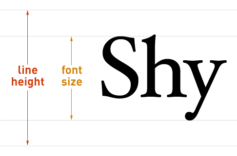
Every paragraph you’ve ever seen has 3 primary dimensions. The first two, font size and line height, are vertical in nature.

Figure 1. How font size and line height work in web browsers. Font size is measured from the top of a capital letter (S) to the bottom of descending characters (y). Half the line height extends both up and down from the centerline of the text.
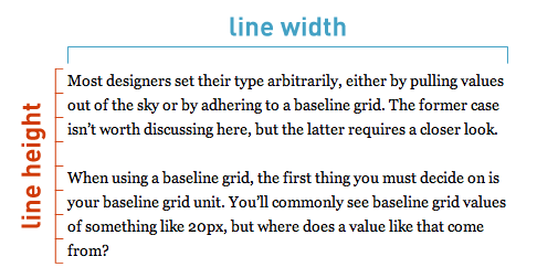
The third dimension, line width, is horizontal.

Figure 2. Line height and line width form the vertical and horizontal dimensions of typography.
Taken together, these 3 dimensions are responsible for how you perceive typography.
To get a feel for how these dimensions work together, it’s helpful to look at a few text samples where one dimension is varied and the others are held constant. This way, you’ll be able to see the effect that each dimension has on the other two.
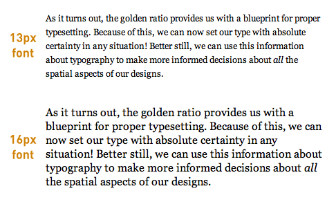
In Figure 3 below, the line height and line width are fixed, and the font size is varied from 13 to 16px.

Figure 3. With the line height and line width held constant, it’s clear that larger font sizes require larger line heights to maintain both proportion and readability.
In the first paragraph of Figure 3, the line height is large enough relative to the font size to produce generous whitespace between the lines of text. However, in the second paragraph, the line height is not large enough relative to the font size to yield sufficient whitespace, and it looks cramped as a result.
This leads to an important conclusion: As font sizes increase, line heights must also increase in order to maintain the geometric proportions of a paragraph. In other words:
Font size and line height are proportionally related.
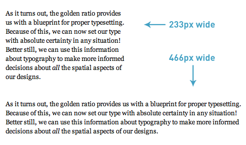
In the next example, the font size and line height are fixed, and the line width is varied from 233 to 466px.

Figure 4. As the line width is increased, the text becomes harder to read because the line height has not been increased to offset the effect of the width.
Despite the fact that the line heights are the same in the two paragraphs of Figure 4, their readability is quite different because of the differing line widths.
As the line width gets longer, it becomes more difficult to perform a return sweep (the movement of the eyes from the end of one line to the beginning of the next) unless the line height is also increased to account for this effect.
Research confirms this conclusion, too. In a 2004 study from the University of Reading (how ironic), Mary C. Dyson states:
Long line lengths are said to need more interlinear spacing to ensure that the eyes locate the next line down accurately when executing a return sweep…
Bottom line? It’s clear that line heights and line widths are mathematically related in some way. More specifically:
For any font size, the line height must increase as the line width increases.
But what is the exact mathematical nature of this relationship?
Harmonious Proportions and the Golden Ratio
Answering this question might be easier than it first seems because nature has given us a remarkable blueprint for beautiful and effective proportionality.
Evident in plants, animals, the shape of galaxies, and even your DNA, this proportionality blueprint is so pervasive that humans have noticed it for thousands of years. We’ve used it, too—it can be seen in art and architecture throughout history.
So what is this incredible proportion that “really ties the room together?”
I’m talking, of course, about the golden ratio.
When nature needs a proportion to relate things and to provide order on any scale, it tends to use the golden ratio.
With typography, the goal is to relate font size, line height, and line width in an aesthetically pleasing and orderly way.
Could it be, then, that the golden ratio is applicable to typography as well?
The Mathematics of Golden Ratio Typography
As you probably guessed, the answer is an emphatic yes! Here’s how it works:
First, the font size (f) and line height (l) are proportionally related through a ratio (h). Mathematically, this is about as simple as it gets, and the basic equation looks like this:
![]()
In the equation above, the optimal line height is produced when h equals the golden ratio (φ). This insight gives us the following equation:
![]()
Unfortunately, just knowing the optimal line height for a given font size is not enough.
Earlier, you saw that all 3 typographical dimensions—font size, line height, and line width—affect one another. Therefore, you cannot talk about line height or font size without also considering the line width.
Based on this reasoning, there must also be an optimal line width that corresponds to the optimal line height from the equation above.
Problem is, you don’t know the exact relationship between line width and line height. All you know for sure is that the line width is significantly greater than the line height.
With the help of basic mathematical modeling, you can make an educated guess that the relationship between the optimal line height and line width is exponential. Here’s the simplest equation to express that:
![]()
This is remarkable because now, for the first time, you have a solid mathematical basis for the relationship between font size, line height, and line width.
Note to designers: Golden Ratio Typography is intended to serve as a basis for proper typesetting. Factors such as x-height and other typeface metrics also influence typography and should be considered in finalized designs. Golden Ratio Typography provides the most rational starting point for adjustments of this nature.
There’s one little problem here, though: The web isn’t nearly as precise as these equations.
You see, web designers are constrained to using integer values for things like font size, line height, and line width (this will be the case until sub-pixel rendering becomes a reality).
The above equations all yield highly precise decimal values, and simply rounding the answers to the nearest integer produces significant errors that will cause your resulting typographical proportions to be imprecise.
The bottom line is that the web is not optimal, and therefore, the optimal equations presented above are insufficient for fine-tuning your typography in the real world.
Ultimately, if you want precise Golden Ratio Typography on your website, then you’re going to need some tuning equations.
Fine-tuning Golden Ratio Typography for the Web
To understand how typographical tuning works, let’s look at an example.
For a font size of 16px, the perfect line height is achieved when h equals the golden ratio. This yields a value of 25.88854px for the optimal line height. Using this value, you can then determine that the associated optimal line width is 670.21670px.
![]()
![]()
If you tried to use these values in your site’s CSS, you’d encounter problems.
Because it only resolves integer values, the web cannot display a line height of 25.88854px. Instead, the best you could do for the line height is 26px.
But 26px is greater than the optimal line height given by the equations, and as you’ve seen, you cannot change the line height—not even a little bit!—without also changing the associated line width (otherwise, the resulting proportions would not be precisely “golden”).
Therefore, the process of rounding the line height from 25.88854px to 26px requires that the resulting line width be greater than 670.21670px.
This is the essence of typographical tuning:
If your line width is shorter than the optimal width, then your corresponding line height must be less than the golden ratio. Conversely, if your line width is longer than the optimal width, your corresponding line height must be greater than the golden ratio.
Here’s a graph to help illustrate this concept for the most commonly-used font sizes:

Figure 5. As line widths increase, line heights must also increase to preserve geometric proportions and readability. The horizontal gray line in this graph represents the golden ratio (φ), and you can see how line heights behave relative to this value for the most commonly-used font sizes. Click to enlarge.
Mathematically speaking, the typographical tuning equations are more complicated than the equations you’ve already seen. Fortunately, I’ve done the heavy lifting here, so you can focus on the concept and the results.
Ultimately, you need two tuning equations for the different scenarios you will encounter while setting typography. Depending on the situation, you’ll need to determine:
- The adjusted line height, given a font size and line width
- The adjusted line width, given a font size and line height
Here are the equations to do just that:

![]()
Using the second equation above, you can determine the adjusted line width for the aforementioned example situation of a 16px font size with an integer line height of 26px.

The adjusted width, which will maintain golden typographical proportions for this scenario, is 685.32505px. For use on the web, this must be rounded to 685px.
Let’s look at another example that will hit closer to home (and this is how you can tune the typography on your own website right now):
What if you wanted to use a 16px font size in a content width of 550px? What should your adjusted line height be in this case?
Here’s how you’d solve that problem:

![]()
The answer here is 25.00169px. Once again, this value must rounded to the nearest integer for use on the web, and this results in an adjusted line height of 25px.
Golden Ratio Typography Calculator
Obviously, doing a bunch of math every time you deal with typography will get tiresome very quickly.
To remedy this, I’ve created the Golden Ratio Typography Calculator, which makes it incredibly easy to determine the perfect typography for any situation!
Smart and versatile, the calculator will give you golden typographical recommendations based on the input you provide.
If you enter only a font size, the calculator will show you the optimal line height and line width for that font size.
If you enter only a width, the calculator will show you the best and second-best font size/line height combinations for that width.
If you enter both a font size and a width, you get the whole shebang:
- Optimized typography for your font size and width
- The best typography for the width you’ve provided
- The second-best typography for the width you’ve provided
- The optimal typography for the font size you’ve provided
Go play around with the Golden Ratio Typography Calculator and explore finely-tuned typography like never before!
The Incredible Impact of Golden Ratio Typography
I hinted at this earlier, but I want to make it clear: The stuff I’ve shared with you today doesn’t just apply to the web. In fact…
Golden Ratio Typography can be used to fine-tune the typography of any medium!
Books, newspapers, magazines, websites, e-readers, you name it—they can all benefit from the improved proportions that Golden Ratio Typography provides.
And now, as you begin to view the world through the lens of Golden Ratio Typography, you’ll notice countless opportunities for typographical optimization.
The Bottom Line
Golden proportions are evident throughout the universe, and they occur in places where form and function combine to produce a beautiful, effective, and useful result.
Remember the mathematical symphony of typography?
By employing Golden Ratio Typography, you’ll ensure that your site has a golden symphony that will appeal to everyone.
Здесь можно оставить свои комментарии. Выпуск подготовленплагином wordpress для subscribe.ru
No comments:
Post a Comment